Typography
Inter is the primary typeface for product UI, marketing, and documentation. Use JetBrains Mono only where code or command syntax is the content.
Network operations system
ssh edge-01 --workflow diagnose
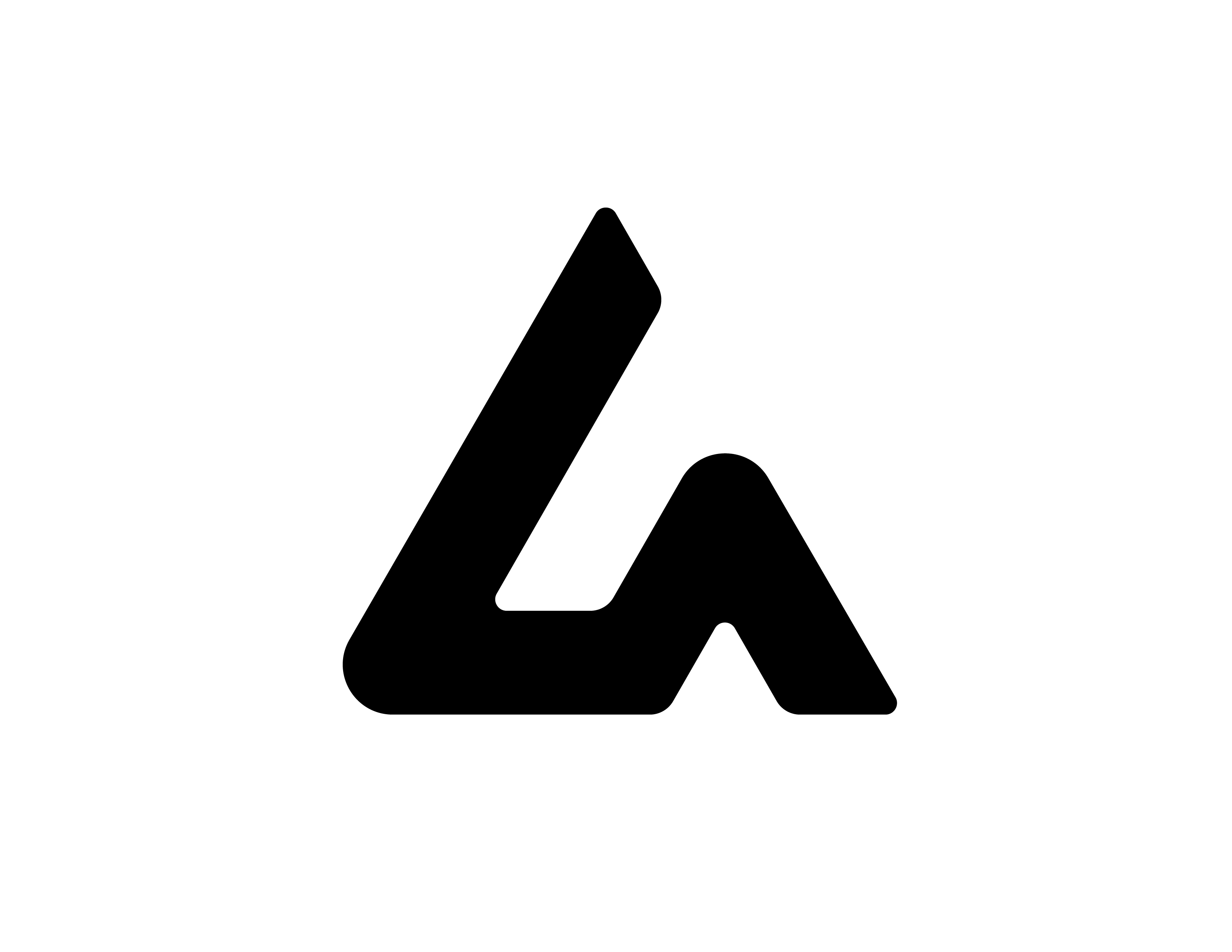
Keep the brand quiet, technical, and precise. The marks should feel like product infrastructure, not decoration.
Inter is the primary typeface for product UI, marketing, and documentation. Use JetBrains Mono only where code or command syntax is the content.
Network operations system
ssh edge-01 --workflow diagnose
The core palette is rich black, white, and neutral tints. Use color as a signal, not a theme.
Leave at least one logomark height around the mark or lockup. Avoid enclosing it in extra shapes unless the surface itself requires a frame.
Choose the smallest lockup that gives enough context. The primary logo is the default for public-facing pages.
Use the exact values below when the brand is reproduced outside the website or product UI.
Neutral tints support borders, secondary text, subtle backgrounds, and quiet product chrome.
#020202
#3D3D3D
#454545
#4F4F4F
#5D5D5D
#6D6D6D
#888888
#B0B0B0
#D1D1D1
#E7E7E7
#F6F6F6